What a good data visualisation should do

If there was a list of skills I could encourage every security analyst to pick up, information visualisation would be high up the list. Today, let’s look at visualisation and what a good visualisation should achieve.
What do we mean by visualisation?
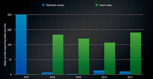
Anything that visually communicates information can be termed a visualisation. The humble bar graph:
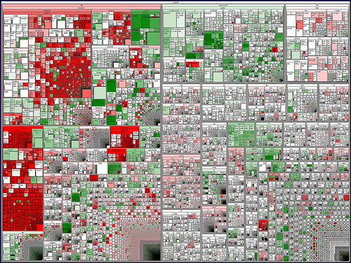
A treemap:
ASCII output:
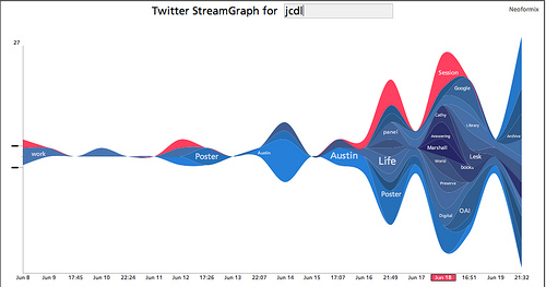
Or a slightly flashier, interactive streamgraph:
Educational vs operational visualisation
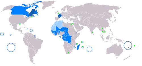
One type of visualisation might educate, by presenting a broad concept: say, how widely French is spoken:
As well as broad education, visualisations may provide new, deep insights on a data set. Here, we’ll focus on generating these deep insights. We’ll call this operational visualisation.
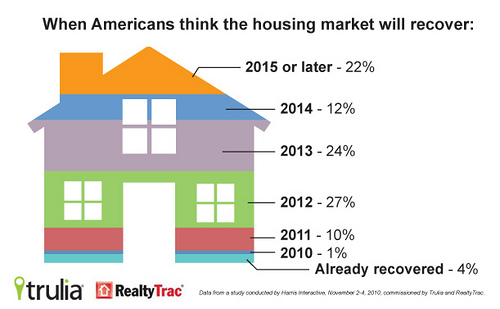
I’m going to be talking about practical, attractive visualisations we can generate programmatically. If you’re after newspaper-like infographics with clip art and funky layouts like this:
…you’d be better going off to read up on Illustrator. We’ll be looking at visualisations that are generated continuously and used every day.
The most basic thing a visualisation should do
If you remember back to high school when you were learning about journalism, you might remember the expression “write for your audience”. It’s easy to forget that as fun as it is for us, our visualisation is ultimately for those viewing it. More than anything, our viewers need to finish viewing our visualization with some new insight. That new insight should not be “Wow, that’s really complex”:
Some visualisations aim to look overly sophisticated or intricate, without imparting anything in particular to the audience.
The most basic thing a visualisation should do: give the viewer new insights. If we haven’t presented some new insight, we’ve missed the mark.
A visualisation should do at least one of the below:
Tell a story
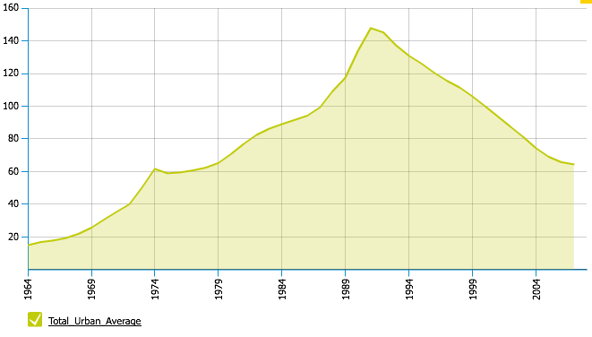
By visually representing our data, we can paint an overall picture of a trend. For example, here’s Tokyo’s real estate since the 1980’s, clearly showing the bubble and the subsequent crash:
Tell us what to look at next
Visualisations take the clutter of a data set, and help us determine points of interest to dig into. For example, this well-known treemap of the US stock market shows us the overall movement of companies, sectors and the market as a whole, while pinpointing the fast movers in bright green and red:
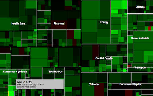
Our analysts could then pick up from there and dive into data on those specific companies.
Discover new relationships
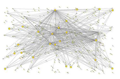
Reconstructing our data as a graphic can reveal new insights. For example, this node-link diagram maps an API by parent and child relationships:
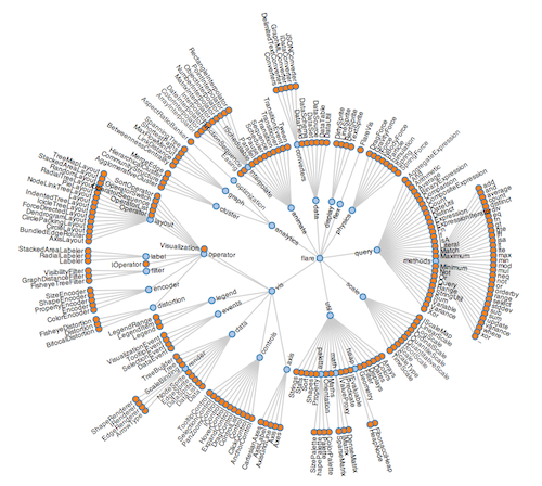
We get an instant impression of the size of the API, how deep it goes, and which parts have most components. This type of technique proves to be very useful in understanding network topologies and interconnections.
Be attractive
A visualisation should show care and attention to presentation. We say “Don’t judge a book by its cover” for a reason: it’s what we naturally do. If your visualization looks like it was thrown together quickly, people may assume that the underlying data is low quality.
What does attractive mean? It’s subjective, but at a minimum:
- Remove clutter: like composing a photo, it’s what you remove that makes the photo great.
- Attention to detail: lack of typos count. Clear labels count.
- Anti-aliasing: those jaggy edges you see on a lot of graphing tools leave things looking a little “rustic”. Using the right tools, anti-aliasing will be taken care of, giving a more professional result.
Summary
- Creating visualisations is an essential tool in any analyst’s toolkit.
- Design for your audience; focus on your intended message.
- A visualisation should: tell a story; tell an analyst what to look at next; reveal new relationships; be attractive.
Next in the visualisation series: what visualisation technologies should we use?