The Great Visualization Technology Bake-Off

So, we’ve looked at what a good visualization should do. Next: the how. What type of visualization technologies should we use?
In this article, we’re going to look at a variety of visualization technologies, then make an evaluation about which ones work best in our toolbelt.
Before we get there, let’s talk about what type of visualization we want. We want it to be deep and operational: not style without substance (a.k.a. management porn) or a lightly educational infographic that would appear in The USA Today. This won’t be a one-off - we want something we are going to look at every day and gain new operational insight.
Like any technology decision, let’s start with some requirements for our chosen visualization technology:
-
Automation: we should be able to generate and update our visualization automatically. This might be periodic via cron, or via a realtime feed of data. The rule is: if any manual effort is needed to maintain the visualization, it’s doomed.
-
Repeatability: we should be able to take new data, run it through the same algorithm, and get a new visualization with no human involvement. Laziness is a perversely good motivator.
-
Accessibility: our visualization should be ideally be accessible to anyone without the need for special plugins. Especially when we’re dealing with secure environments or big corporates, our viewers often don’t have the ability to install any new software.
-
Interactive: this can be as simple as allowing clicks to dig further into information. This is essential for deep understanding of the data presented. For example: what’s the IP address represented by that big, red point?
-
Animation capable: certain types of visualizations can benefit greatly from appropriate animations. As well as showing an effect over time, it’s a great way to show the effect of filters while allowing the viewer to see the transition take effect. For a great example of this in action, how would the relationship between size and count feel different in this D3 treemap if we had to reload the whole page to switch?
-
Ease of use: how much work do we need to put in to get a visualization out?
Though it’s not a requirement for everyone, I’m only going to consider tools that are free or low cost.
When it comes to the “how” of visualization, we’ve got multitudes of tools available to us. Here’s a shortlist of contenders:
Static images from command line tools
There’s legions of tools available to generate static graphic files from data. Let’s also consider them together with graphical libraries like GD you can access via programming languages.
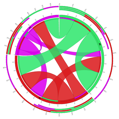
One very popular tool in this class is Graphviz, which outputs static images along with more dynamic formats such as SVG. Below is the output from another tool called Circos, an interesting way of displaying 2D tables (as well as bioinformatics, if you’re into that):
Roundup:
 Automation: brilliantly cron-able.
Repeatability: after massaging our data to the correct format, we can run it many times.
Accessibility: top marks, given that we can view static image files on just about any device you’d want to name. They’re also easy to email and post up to the web.
 Interactivity: being static, very little. We can add the static image to a web page and add links and imagemaps to give it some interactivity, but this is starting to become a web visualization at this point.
 Animation: some static graphic formats give us simple animations, but they're fairly limited.
Ease of use: while some tools just require piping in a packet capture or CSV file, some have arcane config files that must be precisely set before getting a result. Circos, I'm looking at you.
Desktop tools
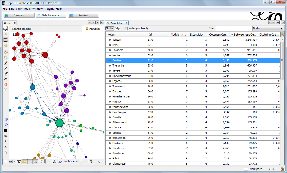
Desktop tools can let us put together some sophisticated visualisations, make hand-crafted changes, and assist with data import. There’s many tools like this, one of which is Gephi:
Roundup:
Automation: some desktop tools output visualizations which can be plugged into live data feeds, but these tend to be limited to what's supported out of the box.
Repeatability: yes, many have algorithmic means of turning a data feed into a visualization.
Accessibility: depends on the output format. A format like PNG is very accessible, but a proprietary format may need a special viewer - a common example would be Excel spreadsheets. Likewise, not every desktop tool runs on every operating system.
Interactivity: once again, very dependent on the output format, but you can create some highly functional visualizations.
Animation: some GUI tools are strong here.
Ease of use: while varying from product to product, on the whole, GUIs, inline help and data import wizards can get us up and running fast.
Proprietary development environments
This includes any type of closed plugin enabling visualisation. For the sake of argument, let’s look at one of the biggest, Flash:
Roundup:
Automation: Flash can read in live streams of data, so can be automated quite well.
Repeatability: Flash is code-driven, so highly repeatable.
Accessibility: this is where Flash falls down. While being installed on a majority of desktops, thanks to Apple's determined refusal to include Flash in iOS, choosing Flash cuts out a large percentage of the potential viewing population for your visualization.
Interactivity: Flash does a very good job here.
Animation: one of the reasons Flash made its mark was for excellent animation capabilities.
Ease of use: Flash can require some programming know-how, but it's backed up by some very nice development suites, too.
HTML + JavaScript
The web used to be text and tables, but now it’s so, so much more. Open development using Canvas and SVG for graphics as well as the DOM itself offer extremely rich functionality. One popular visualization library written in JavaScript is Protovis. It’s highly flexible and capable, as you can see in this example:
Roundup:
Automation: we can output HTML or data files via cron, or stream them into a web browser using JavaScript and JSON. With such a flexible format which is essentially text, there's really not many limits to what we can automate.
Repeatability: JavaScript visualization libraries algorithmically handle lay out, so good marks for this, too.
Accessibility: I'd like to give a 90% star to this. Any modern browser on desktops or mobile devices can load a very sophisticated visualisation. Downside: the definition of "modern" varies - some organisations are still stuck with Internet Explorer 6. For the most part though, accessibility is excellent and universal, and distribution is as simple as sending a URL.
Interactivity: web technologies offer from basic hyperlinks all the way to sophisticated event handling and gestures on mobile devices.
Animation: Using the right libraries, we can put together some amazing animations with HTML and JavaScript. Libraries like D3 are doing a great job here.
Ease of use: to get started with web based visualizations, you're going to need to get your hands dirty cutting some code. However, there are some fantastic visualization libraries to help you out.
Judgement
The technology you pick is dependent on the specific problem you want to solve and your current skill set. However, you’d need a good reason not to pick HTML + JavaScript for your next visualization.
So, why go HTML and JavaScript? If you’re a technical person looking for a technical visualization, web technologies will give you the most latitude to do some extraordinary, open visualizations, in a way that more people can easily view it. It ticks all our requirements, at the cost of a steeper learning curve, which will get easier over time.
Also assisting with that learning curve is the fact that HTML + Javascript visualisation are, by their very nature, open (in the sense that you can read the source and learn from it, at least). Do you want to see how someone else put a great visualization together? “View source” is your best friend.
Developing our HTML visualization won’t be quite as easy as plugging data into our desktop tool - but not that far off it, as we’ll soon learn. In the next post in the series, we’ll look at the knowledge and tools that will help us get our first HTML visualization off the ground. If you know very little about HTML but can drive a text editor, you’re going to be pleasantly surprised how fast we’re up and running.
Until next time!
Chris